What are the most common cancers in your county? How does your county compare to the state? Get the latest data about cancer risks, screening rates, and health outcomes for every county in Wisconsin.
Use this interactive data dashboard to identify potential needs in your community, create evidence-based programming, raise public awareness, and more.
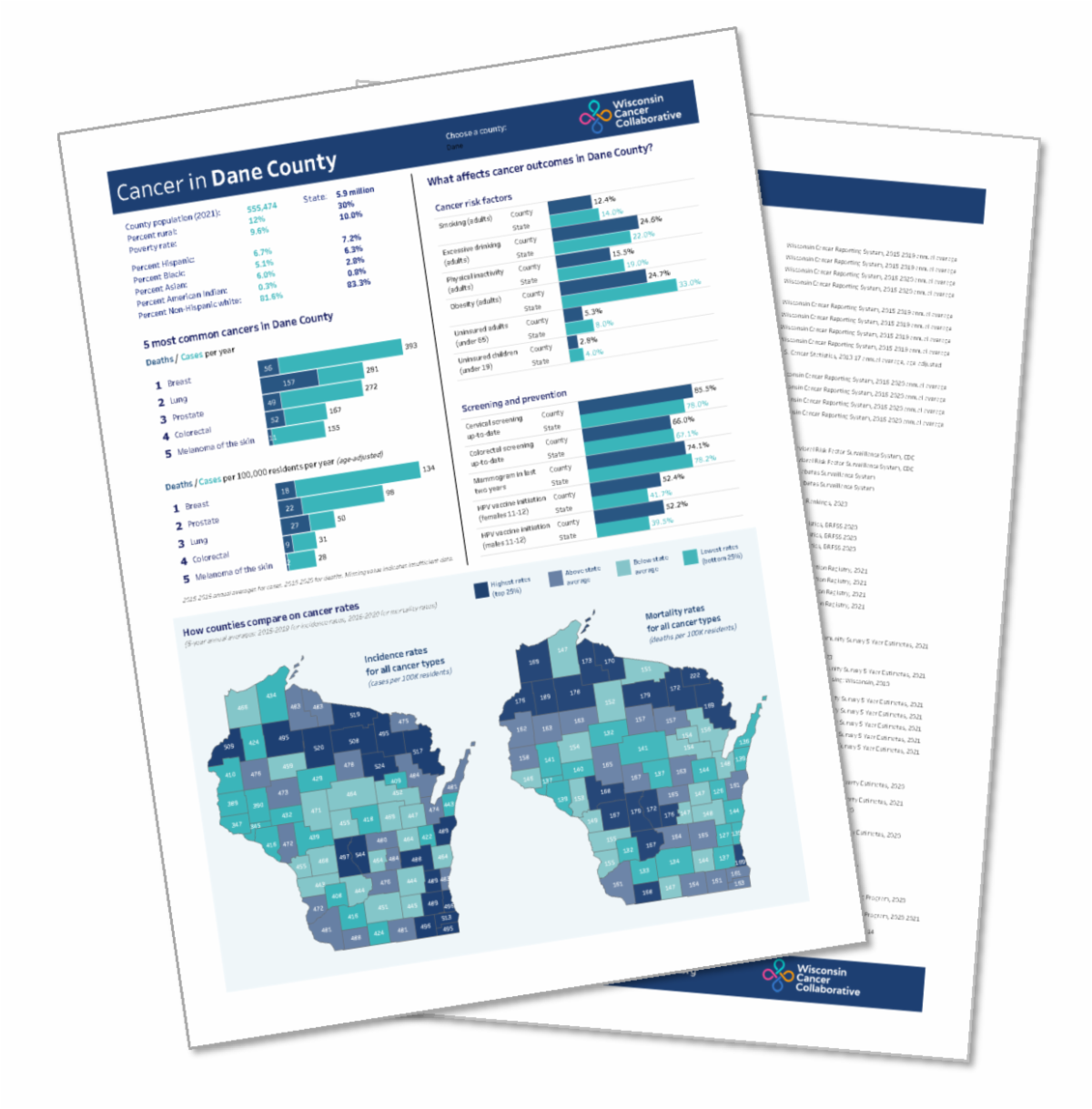
The Interactive Dashboard features the information from the Wisconsin County Cancer Profiles, launched last month, with a specific profile for each of Wisconsin’s 72 counties.
The two-page profiles offer the opportunity to see how your county compares to statewide averages and other counties around the state. They combine data from multiple sources, such as the Wisconsin Cancer Reporting System, the Wisconsin Immunization Registry, and the Behavioral Risk Factor Surveillance System, and the U.S. Census.
The dozens of data points for each county help outline the state of cancer in that area, offering a view of successes and possible areas for future improvement.